stir.html · 30 lines
<!DOCTYPE html><html><head><style>
body{margin:0;height:100vh;background:#e8dccb;display:flex;align-items:center;justify-content:center;overflow:hidden}
.scene{position:relative;width:400px;height:360px}
.saucer{position:absolute;left:30px;top:270px;width:340px;height:60px;border-radius:50%;background:#f4f4f4;box-shadow:0 8px 12px rgba(0,0,0,.3),inset 0 -6px 8px #bbb}
.handle{position:absolute;left:290px;top:130px;width:70px;height:90px;border:20px solid #fff;border-left:none;border-radius:0 60px 60px 0;box-shadow:2px 3px 5px rgba(0,0,0,.3)}
.cup{position:absolute;left:60px;top:110px;width:260px;height:180px;background:linear-gradient(90deg,#ddd,#fff 30%,#fff 60%,#ccc);border-radius:0 0 130px 130px/0 0 170px 170px;box-shadow:0 4px 8px rgba(0,0,0,.3)}
.rim{position:absolute;left:55px;top:90px;width:270px;height:70px;border-radius:50%;background:#fff;box-shadow:inset 0 -3px 6px #bbb}
.coffee{position:absolute;left:67px;top:97px;width:246px;height:56px;border-radius:50%;background:radial-gradient(ellipse,#6b3a1c,#3b1c0b 80%);overflow:hidden}
.swirl{position:absolute;left:50%;top:50%;width:150px;height:30px;margin:-15px 0 0 -75px;border-radius:50%;border:4px solid rgba(220,170,110,.35);border-left-color:transparent;border-bottom-color:transparent;animation:sp 2s linear infinite}
.swirl.b{width:90px;height:18px;margin:-9px 0 0 -45px;animation-duration:1.3s}
@keyframes sp{to{transform:rotate(360deg)}}
.orbit{position:absolute;left:190px;top:125px;width:0;height:0;animation:orb 2s linear infinite}
@keyframes orb{from{transform:rotate(0)}to{transform:rotate(360deg)}}
/* ellipse path: x radius 70, y radius 15 */
.path{position:absolute;left:190px;top:125px;width:0;height:0}
.sx{position:absolute;left:0;top:0;animation:px 2s linear infinite}
.sy{position:absolute;left:0;top:0;animation:py 2s linear infinite}
@keyframes px{0%{transform:translateX(0)}25%{transform:translateX(50px)}50%{transform:translateX(0)}75%{transform:translateX(-50px)}100%{transform:translateX(0)}}
@keyframes py{0%{transform:translateY(-14px)}25%{transform:translateY(0)}50%{transform:translateY(14px)}75%{transform:translateY(0)}100%{transform:translateY(-14px)}}
.spoon{position:absolute;left:-5px;top:-8px;width:10px;height:200px;transform-origin:5px 8px;transform:rotate(25deg) translateY(-150px);}
</style></head><body><div class="scene">
<div class="saucer"></div><div class="handle"></div><div class="cup"></div><div class="rim"></div>
<div class="coffee"><div class="swirl"></div><div class="swirl b"></div></div>
<div class="path"><div class="sx"><div class="sy">
<div style="position:absolute;left:-9px;top:-9px;width:18px;height:10px;border-radius:50%;background:radial-gradient(#eee,#999);z-index:2"></div>
<div style="position:absolute;left:-3px;top:-110px;width:7px;height:105px;background:linear-gradient(90deg,#999,#eee,#999);transform-origin:50% 100%;transform:rotate(18deg);border-radius:3px"></div>
</div></div></div>
<div style="position:absolute;left:67px;top:97px;width:246px;height:56px;border-radius:50%;box-shadow:inset 0 3px 6px rgba(0,0,0,.4)"></div>
</div></body></html>
round 1 of 2
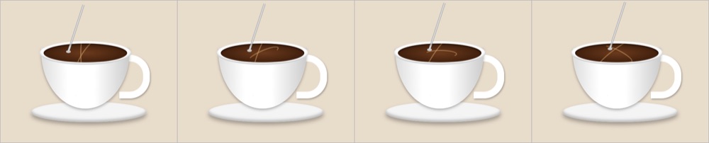
A spoon stirring in a cup, in HTML and CSS: Claude Sonnet 5.5
modelanthropic/claude-sonnet-5.5taskcss-stirring-spoon@v1, checks c1, harness h1date2026-10-19rounds2 of 8 allowed, 12 minutes on the clockcost$0.0101thinkingmediumtokens24,768 in, 2,522 out, of which 249 reasoningtime51 s
HTML and CSS onlydecided by a number, from the filepass
A CSS loop that moves somethingdecided by a number, from the filepass
Reads as a cup seen intodecided by looking · someone else could reasonably disagreepass
The spoon does the stirringdecided by looking · someone else could reasonably disagreepass
Reads as inside the cupdecided by looking · someone else could reasonably disagreepass
Handle stays on the bowldecided by looking · someone else could reasonably disagreepass
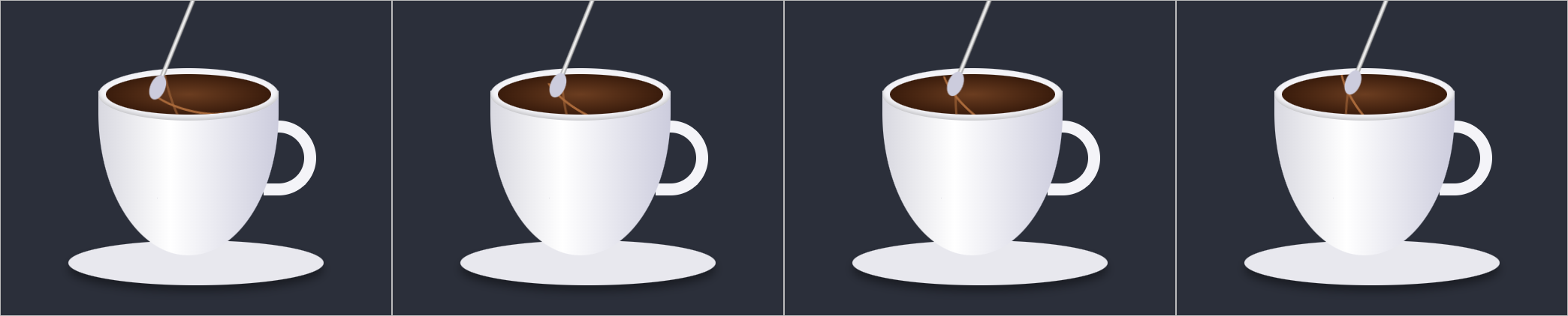 run 1 · 2r · $0.0103
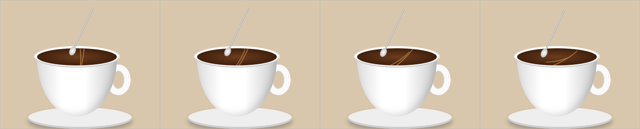 run 2 · 2r · $0.0074
same prompt, other modelsall 9 runs on A spoon stirring in a cup, in HTML and CSS →
Using only HTML and CSS, with no JavaScript, SVG or images, make a cup of coffee with a spoon stirring round and round inside it.Frozen at v1. This model got this and nothing else.
HTML and CSS alone, a continuous loop, and a cup seen from slightly above. The file is read for the brief and for the loop: an @keyframes rule that changes a position or a transform, named by an element, with the iteration count set to infinite. The picture is four moments of the animation, left to right, taken at 0.4 s, 1.2 s, 2.0 s and 2.8 s. Whether the rim reads as an ellipse seen from above, whether the spoon passes behind the far rim on the back half of its circuit, and whether the handle stays on the bowl are judged by eye from the page the run rendered, with the four frames as a first look. How it is scored, and this run's files on GitHub.