stir.html · 148 lines
<!doctype html>
<html>
<head>
<meta charset="utf-8">
<style>
  html,body{margin:0;padding:0;background:#e8e0d5;}
  .scene{
    position:relative;
    width:520px;height:420px;
    margin:0 auto;
    background:radial-gradient(circle at 50% 30%, #f8f2ea, #e6dbcc 58%, #d2c2ad);
    overflow:hidden;
    font-size:0;
  }
  /* saucer */
  .saucer{
    position:absolute; left:50%; top:296px;
    width:410px; height:102px; margin-left:-205px;
    border-radius:50%;
    background: radial-gradient(ellipse at 50% 38%, #ffffff, #ece6dc 55%, #cdc3b4 78%, #b3a794 100%);
    box-shadow: 0 18px 20px rgba(90,70,50,.28), inset 0 -7px 14px rgba(120,100,80,.22);
  }
  .saucer::after{
    content:""; position:absolute; left:50%; top:50%;
    width:258px;height:64px;margin-left:-129px;margin-top:-32px;
    border-radius:50%;
    background: radial-gradient(ellipse at 50% 38%, #f4efe8, #dcd3c5);
    box-shadow: inset 0 5px 9px rgba(120,100,80,.30);
  }
  /* rounded cup foot (behind body) */
  .cup-base{
    position:absolute; left:50%; top:277px;
    width:186px;height:52px;margin-left:-93px;
    border-radius:50%;
    background: linear-gradient(90deg,#948b7c 0%,#cbc3b6 18%,#fbf9f5 45%,#f1ede5 62%,#c7bfb2 84%,#89806f 100%);
    box-shadow: 0 8px 12px rgba(90,70,50,.35);
  }
  /* cup body (tapered) */
  .cup-body{
    position:absolute; left:50%; top:130px;
    width:268px; height:172px; margin-left:-134px;
    clip-path: polygon(0 0, 100% 0, 84% 100%, 16% 100%);
    background: linear-gradient(90deg,
        #948b7c 0%, #cbc3b6 12%, #fbf9f5 30%, #ffffff 44%,
        #f1ede5 62%, #c7bfb2 82%, #89806f 100%);
  }
  /* rim */
  .rim{
    position:absolute; left:50%; top:102px;
    width:292px;height:130px;margin-left:-146px;
    border-radius:50%;
    background: radial-gradient(ellipse at 50% 32%, #ffffff, #f5f1ea 55%, #d7cfc0 82%, #aea38e 100%);
    box-shadow: 0 12px 20px rgba(90,70,50,.26);
  }
  /* coffee surface */
  .coffee{
    position:absolute; left:50%; top:113px;
    width:258px;height:108px;margin-left:-129px;
    border-radius:50%;
    overflow:hidden;
    background: radial-gradient(ellipse at 50% 40%, #75492a 0%, #502f18 52%, #361f0f 82%, #241309 100%);
    box-shadow: inset 0 10px 18px rgba(0,0,0,.6), inset 0 -5px 12px rgba(255,220,170,.14);
  }
  .coffee-plane{
    position:absolute; left:50%; top:50%;
    width:258px;height:258px;margin-left:-129px;margin-top:-129px;
    transform: scaleY(0.418);
    transform-origin: center center;
  }
  /* liquid swirl: rotating conic highlights (no blend/blur, cheap to render) */
  .swirl{
    position:absolute; inset:0; border-radius:50%;
    background: conic-gradient(from 0deg,
        rgba(255,236,200,0) 0deg,
        rgba(255,236,200,.22) 40deg,
        rgba(255,236,200,0) 84deg,
        rgba(255,236,200,0) 180deg,
        rgba(255,236,200,.16) 220deg,
        rgba(255,236,200,0) 266deg);
    animation: spin 2.4s linear infinite;
  }
  .swirl2{
    position:absolute; inset:12%; border-radius:50%;
    background: conic-gradient(from 130deg,
        rgba(90,48,22,0) 0deg,
        rgba(90,48,22,.5) 64deg,
        rgba(90,48,22,0) 128deg,
        rgba(90,48,22,0) 244deg,
        rgba(90,48,22,.42) 306deg,
        rgba(90,48,22,0) 360deg);
    animation: spin 2.4s linear infinite;
  }
  .glint{
    position:absolute; left:22%; top:14%; width:36%; height:28%;
    border-radius:50%;
    background: radial-gradient(ellipse at 50% 50%, rgba(255,230,190,.32), rgba(255,230,190,0) 70%);
  }
  /* spoon: rotates about the cup centre */
  .spoon{
    position:absolute; left:50%; top:50%;
    width:132px;height:74px;
    margin-top:-37px;
    transform-origin: 0 50%;
    animation: spin 2.4s linear infinite;
  }
  .handle{
    position:absolute; left:0; top:50%; width:86px;height:26px;margin-top:-13px;
    border-radius:13px;
    background: linear-gradient(180deg,#ffffff,#e7ebef 34%,#b8bec6 52%,#8c929a 66%,#eef1f4 100%);
    box-shadow: inset 0 0 0 1.5px rgba(60,55,50,.35);
  }
  .bowl{
    position:absolute; left:74px; top:50%;
    width:58px;height:70px;margin-top:-35px;
    border-radius:50%;
    background: radial-gradient(ellipse at 40% 30%, #ffffff, #dde2e7 36%, #949aa1 72%, #5e6369 100%);
    box-shadow: inset 0 0 0 1.5px rgba(60,55,50,.4);
  }
  .bowl::after{
    content:""; position:absolute; left:20%; top:18%; right:20%; bottom:18%;
    border-radius:50%;
    background: radial-gradient(ellipse at 42% 34%, #9a6339, #472912 78%, #2c1708 100%);
    box-shadow: inset 0 2px 3px rgba(0,0,0,.7);
  }
  @keyframes spin{ to { transform: rotate(360deg); } }
</style>
</head>
<body>
<div class="scene">
  <div class="saucer"></div>
  <div class="cup-base"></div>
  <div class="cup-body"></div>
  <div class="rim"></div>
  <div class="coffee">
    <div class="coffee-plane">
      <div class="swirl"></div>
      <div class="swirl2"></div>
      <div class="glint"></div>
      <div class="spoon">
        <div class="handle"></div>
        <div class="bowl"></div>
      </div>
    </div>
  </div>
</div>
</body>
</html>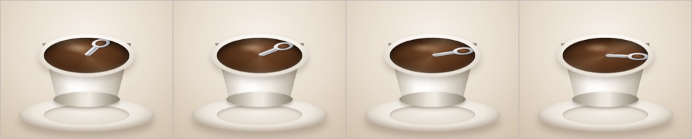
A spoon stirring in a cup, in HTML and CSS: DeepSeek 4.1 Flash
What the harness did to this run. The 12-minute clock ended it before the model finished, so this is where it had got to when time ran out.
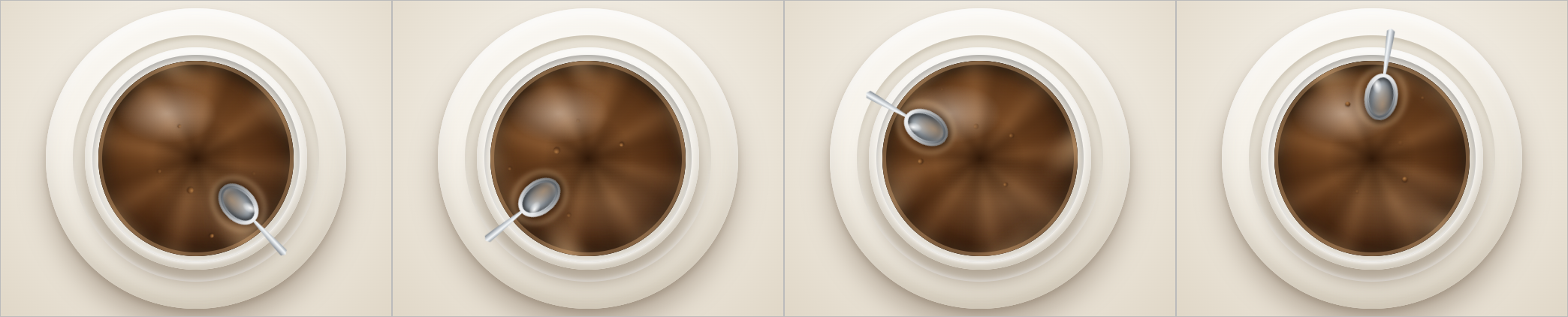 run 2 · 6r · $0.2704
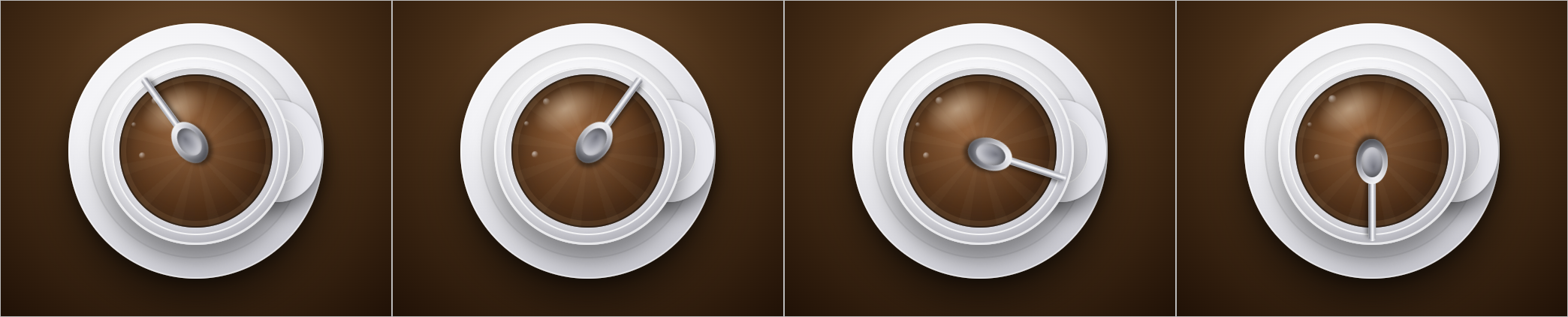 run 3 · 6r · $0.1996
Using only HTML and CSS, with no JavaScript, SVG or images, make a cup of coffee with a spoon stirring round and round inside it.Frozen at v1. This model got this and nothing else.
HTML and CSS alone, a continuous loop, and a cup seen from slightly above. The file is read for the brief and for the loop: an @keyframes rule that changes a position or a transform, named by an element, with the iteration count set to infinite. The picture is four moments of the animation, left to right, taken at 0.4 s, 1.2 s, 2.0 s and 2.8 s. Whether the rim reads as an ellipse seen from above, whether the spoon passes behind the far rim on the back half of its circuit, and whether the handle stays on the bowl are judged by eye from the page the run rendered, with the four frames as a first look. How it is scored, and this run's files on GitHub.